Darkroom Cinema Mobile App
The speculative Darkroom Cinema is a regional movie theater chain showing new releases as well as special showings of classic films, providing a welcoming environment for casual attendees and cinephiles alike. The project presented here is a wholly new mobile app for the chain. The goal for the product was to enable a wide cross-section of users to make easy and confident movie ticket purchases while engendering loyalty and repeat business.
Duration
2 months — Mid 2021
Role
UX Designer
Responsibilities
Research, user interviews, ideation, wireframes, prototypes, user testing, visual design
Challenges to Address
- Provide a familiar experience — Users most comfortable with the in-person ticket-buying process want a recognizable digital experience.
- Lower the burden to successful checkout — Make sure users aren't turned away by distractions or onerous login requirements.
- Allow a quick, frictionless path — Speed and ease of checkout is important for experienced users.
- Bridge the digital and physical experiences — Ensure users know the next steps to follow when checkout is finished.
Research
User Interviews
In order to understand why users currently use mobile apps for purchasing movie tickets, why some moviegoers are hesitant to puchase tickets though an app, and what frustrations they all encounter, I conducted a series of interviews. I drew my participants from a cross-section of ages and genders; what they had in common was that they attend the movie theater at least twice in a normal year. Through these interviews I identified three key pain points:
- Unfamiliarity: Users accustomed to buying tickets at the theater but not through apps are intimidated by a new and unfamiliar process, but want the benefits.
- Time: No one, working adults especially, wants to spend unnecessary time purchasing tickets.
- Flow: Users are frustrated when they lose their place in the ordering process or information they’ve entered is discarded.
Personas
After analyzing the user interviews, I created two key personas to represent the user base as a whole.
Belinda
- Age: 32
- Occupation: Speechwriter
Belinda needs to purchase movie tickets quickly and reduce time spent in line because she wants to maximize the time she spends with her family.
Belinda is a professional, busy with her career and her young family. She likes going to the movies on weekend date nights with her spouse and attending matinee showings with her daughter. She has a few favorite theaters that she prefers to book tickets at. Date nights require a babysitter, so she tries to minimize extra time spent at the theater. Preordering tickets is great because she can skip the line. She’s occasionally frustrated when the buying process goes wrong and she has to contact customer service.
Harry
- Age: 61
- Occupation: Accountant
Harry needs to order movie tickets in a familiar manner because he wants to continue going to the theater while taking advantage or pre-ordering and seat reservations.
Harry is accustomed to smartphones but often hestitates to try out new apps — especially ones that ask for his personal info or credit card number. He has been a regular moviegoer his whole life, and typically knows what he wants to see before he arrives at the theater. Harry would like to reserve his seat ahead of time, but he is most comfortable buying in person at the theater. He’s frustrated when shopping apps deviate too much from the in-person buying experience.
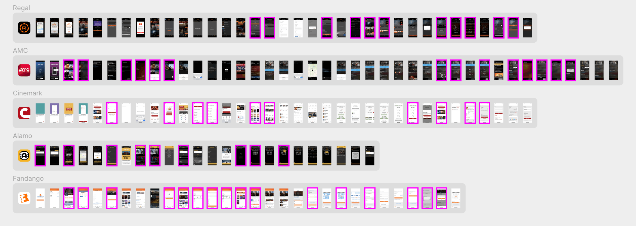
Competitive Analysis
I analyzed mobile apps from several competing theater chains, making note of potential functionality gaps to address. All of the apps are generally of good quality and offer more or less the same basic user flow: select a movie, showtime, seat(s), and then enter payment info to purchase the tickets. The key observations I made were:
- No app completely nails the user flow from start to finish.
- Sorting and filtering options are missing, spotty, or confusing.
- It’s sometimes unclear how to move backwards and forwards in the flow, and what selections will be lost when moving backwards.
- Membership and sign-in prompts are very much present; it's possible but harder to checkout as a guest.
- Brand presence varies from good to barely there.
Design and Testing
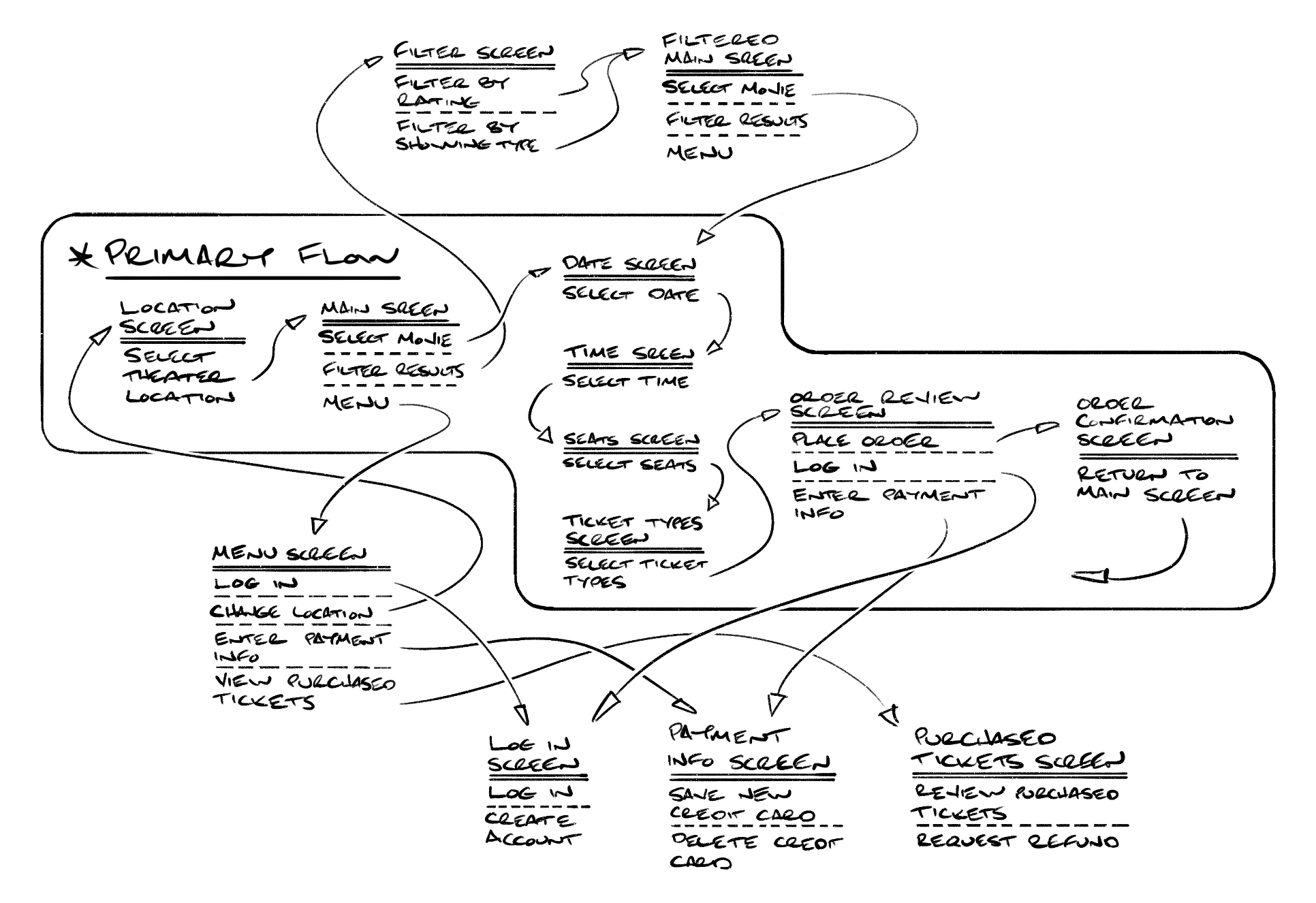
User Flow
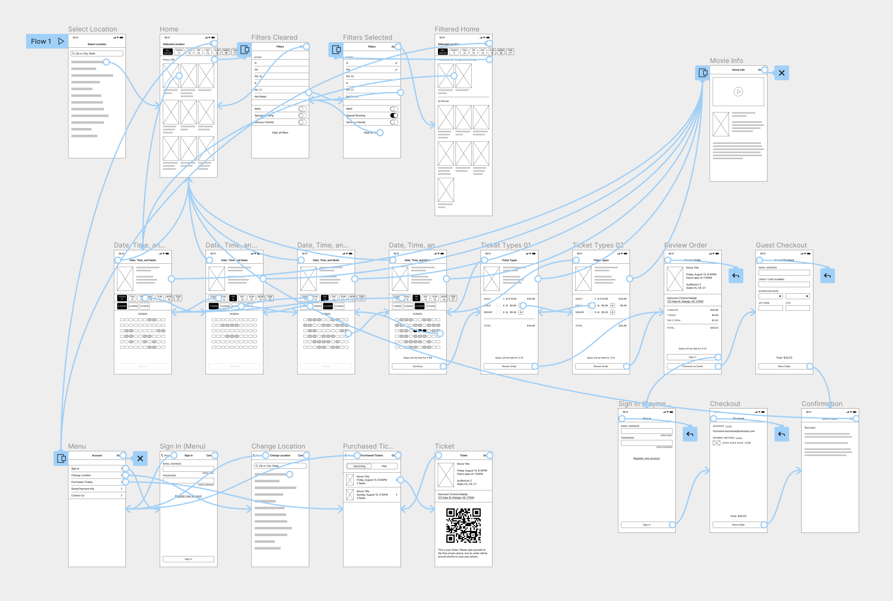
Drawing on my initial research, I began the design process by sketching a basic user flow. The primary path consists of selecting a location, movie, showtime and seats, and then checking out. Ancillary functions, such as filtering movie selections and accessing account settings, are separated out into secondary paths.
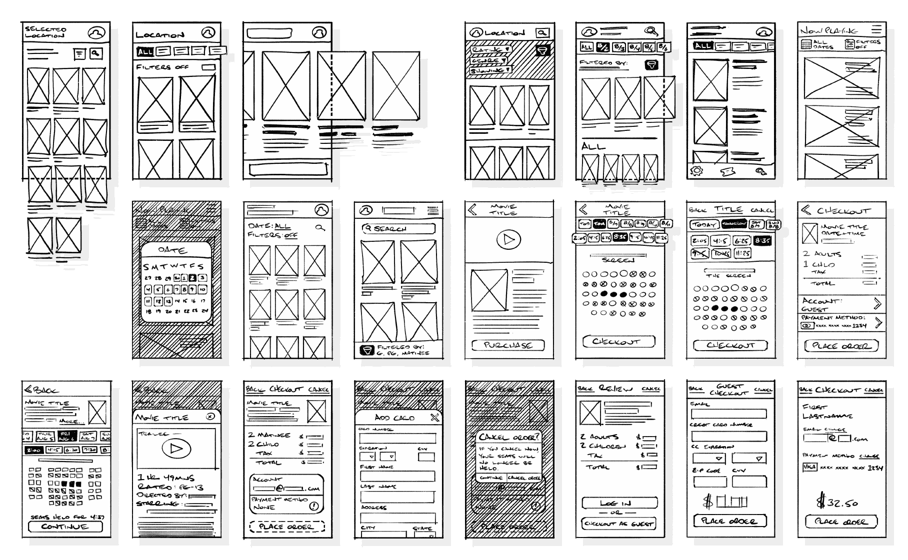
Ideation
I explored a range of areas with hand-drawn wireframes. I gave a lot of attention to how the movies are presented on the main page, as this is where users will start after selecting their theater location. Other areas of focus include the date and time selectors, the seat selector, additional movie info, and the checkout screens.
Interactive Wireframe
I then brought the user flow and ideation together in a more polished interactive wireframe created in Figma. This would form the basis of the first round of usability testing.
Usability Testing
After creating a low-fidelity prototype, I conducted in-person testing with five participants. Participants were asked to complete a series of tasks and then answered scripted followup questions about their experiences. The primary findings were:
- Movie filtering was at best a novelty, and at worst confusing to some participants.
- Participants didn’t mind extra taps to get to additional movie info, but some participants missed it entirely.
- The location of already purchased tickets needs to be more obvious.
Refinement
After an initial high-fidelity prototype and a second, shorter round of user testing, I arrived at the current design shown here. Below are the four challenges outlined earlier and how I addressed them in final design.
Challenge 1
Provide a Familiar Experience
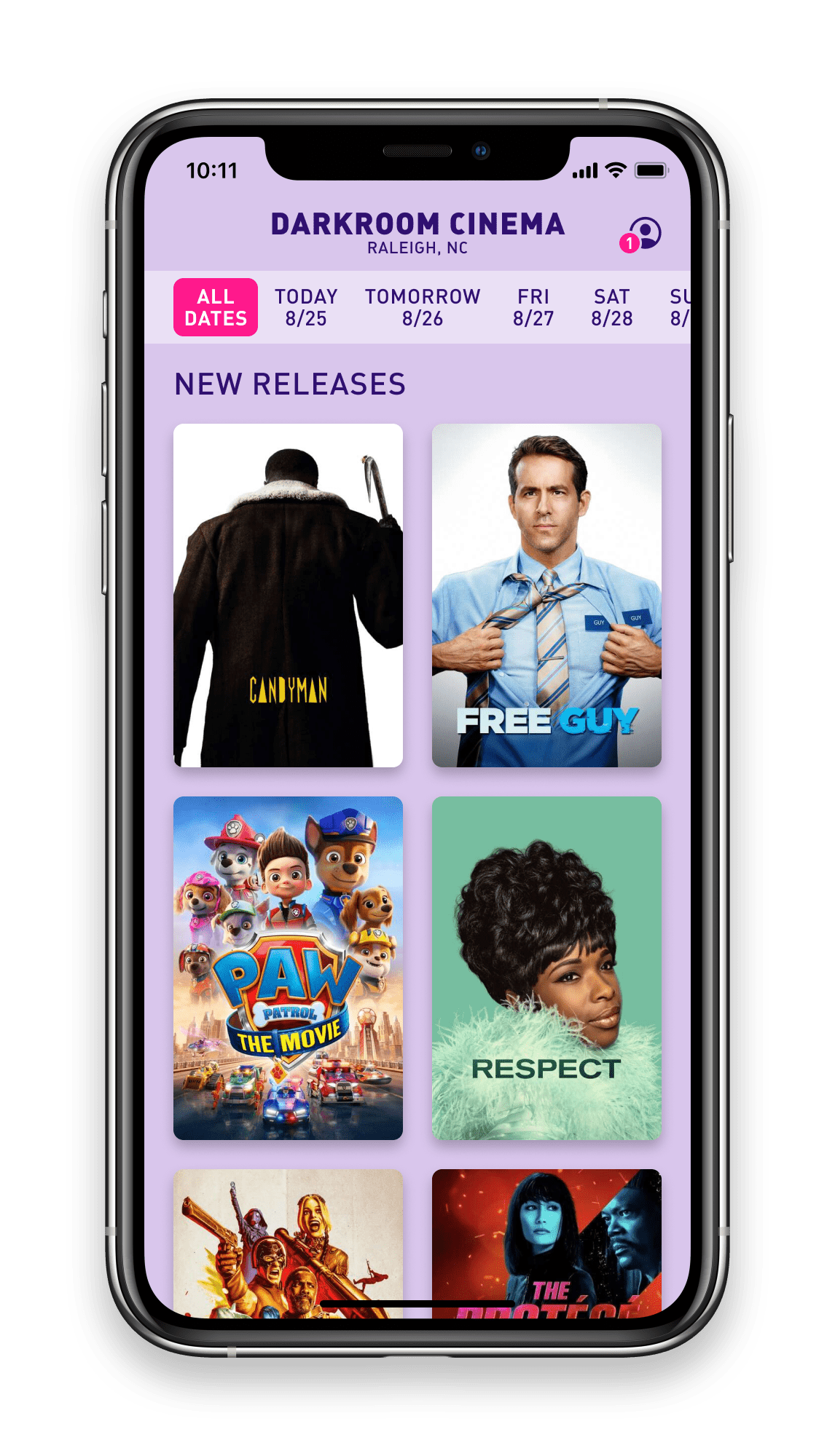
The primary user flow mimics the in-person ticket buying experience: choose the theater location, date, movie, time, and then finally seats. Movies are presented as posters. These decisions help to map the in-person experience onto the digital app and provide a recognizable process for users more comfortable purchasing tickets in-person.
Challenge 2
Lower the Burden to Successful Checkout
While sign-in and account creation prompts are available at multiple points in the user flow, the guest checkout process is presented with equal stature, ensuring that users don’t abandon the process due to a hesitancy to create an account.
Challenge 3
Allow a Quick, Frictionless Path
For experienced users, the primary flow for purchasing tickets and checking out is smooth and clear. No unnecessary screens or other detours impede the path to a quick purchase.
Challenge 4
Bridge the Digital and Physical Experiences
The app is only the beginning of the user’s experience. In order to guide them from the digital to in-person experience, brief instructions are given on the order confirmation page. Tickets for upcoming showings are two taps away from the home screen and clearly indicated.
Conclusion
Takeaways
The personas created from the initial user interviews were key to keeping the design on track. I was able to thread the needle between sometimes competing user interests and deliver a successful end design. User testing was also crucial. I kept the movie filtering option in multiple iterations of prototypes before testing revealed that there was no user need. This freed me up to simplify and streamline the main movie selection page.
Next Steps
Many competitors in this market also offer reward programs and the ability to pre-order concessions in their apps. Those features were beyond the product scope of the current Darkroom Cinema, but I think future development should look at incorporating those features.